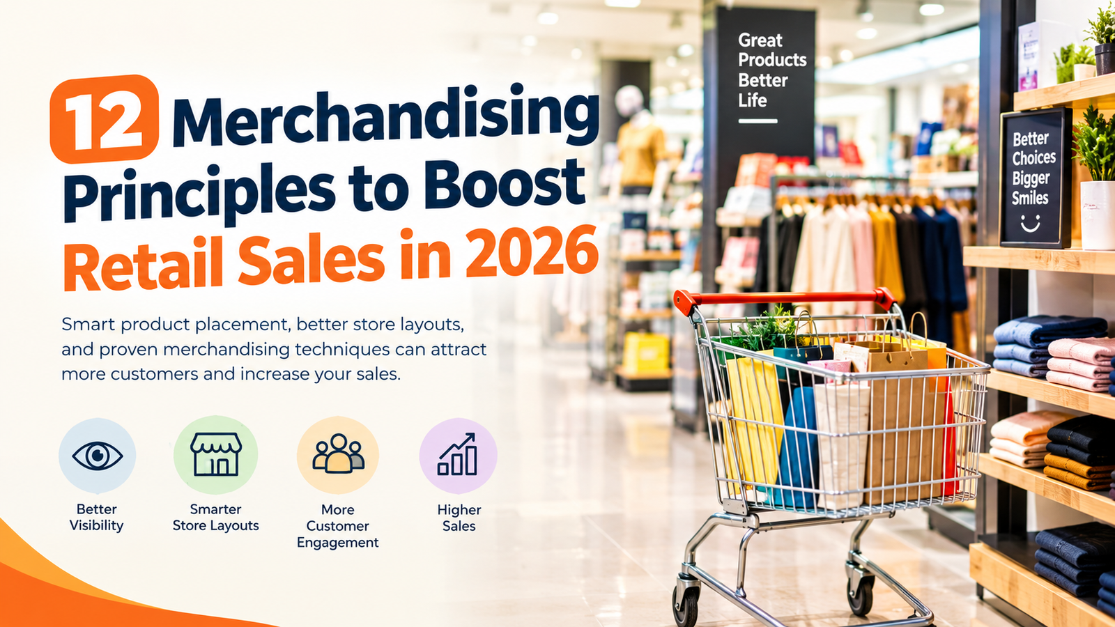
12 Merchandising Principles to Boost Retail Sales in 2026
Merchandising principles help retailers present products in ways that attract attention, simplify shopping, and encourage customers to make informed purchasing decisions. From choosing the right shelf positions to designing effective ecommerce product pages, thoughtful merchandising can improve the shopping experience and support retail sales growth.
Whether you manage a supermarket, clothing store, electronics shop, or online business, the way products are displayed can influence what customers notice and how easily they find what they need.
Effective merchandising is not simply about making products look attractive. It involves understanding customer behavior, organizing inventory, maintaining brand consistency, and evaluating which displays perform best.
In this guide, we explore 12 important merchandising principles, practical examples, common mistakes, and strategies for applying these techniques to both physical stores and ecommerce websites.
What Are Merchandising Principles?
Merchandising principles are guidelines retailers use to plan product selection, placement, presentation, pricing visibility, and promotional displays. Their purpose is to make products easier to discover while helping shoppers understand their options.
Effective merchandising combines several elements, including product positioning, visual design, store layout, signage, seasonal promotions, and inventory management.
For example, a grocery store might place frequently purchased products in easy-to-find locations, while an online retailer could highlight popular items above the fold on its homepage.
The exact approach depends on the products, target audience, store layout, and shopping behavior. Retailers should test different arrangements instead of assuming that one merchandising strategy will work equally well for every business.
1. Eye-Level Is Buy-Level
Product placement is one of the most recognizable merchandising principles. Items positioned near a shopper’s natural line of sight often receive more visibility than products placed on very high or low shelves.
Retailers may use these valuable shelf positions for best-selling products, higher-margin items, new launches, or products they want customers to notice.
However, eye-level placement does not guarantee more sales. Product demand, pricing, packaging, brand familiarity, and customer preferences also influence purchasing decisions.
Example: A supermarket places a popular adult cereal at eye level while positioning children’s cereal on lower shelves that younger shoppers can see more easily.
How to apply it: Track sales by shelf position, rotate selected products, and compare performance before and after changing the display.
For ecommerce stores, the equivalent is placing important products, clear offers, and relevant recommendations near the top of a category page or homepage.
2. Use the Golden Triangle to Improve Store Layout
The golden triangle is a retail layout concept that connects important areas of a store, such as the entrance, a major destination, and the checkout area. These locations can help retailers think strategically about customer movement and product visibility.
A well-planned store layout makes it easier for customers to navigate aisles, discover relevant products, and reach essential departments.
Retailers sometimes position complementary products along common shopping routes. However, essential products should remain easy to locate, and the layout should not create unnecessary inconvenience.
Example: A supermarket places bakery products in a visible destination area and uses clear aisle signage to help customers find dairy products and related items.
How to apply it: Study common customer routes, identify areas that receive little attention, and position relevant promotions where shoppers can see them without obstructing access.
For online stores, customer journeys begin with navigation, category pages, search results, and homepage features. A clear path from product discovery to checkout serves a similar purpose.
3. Apply the Rule of Three
The rule of three is a visual merchandising technique that groups products or design elements in sets of three. Odd-numbered arrangements can create a balanced, natural-looking display and give designers a simple starting point for organizing products.
The technique is a design guideline rather than a universal rule. Other arrangements may work better depending on the available space, product dimensions, and visual identity.
Example: A skincare retailer displays three product sizes side by side: a travel-size option, a standard bottle, and a larger value pack.
This arrangement allows customers to compare the available choices without searching across different shelves.
How to apply it: Experiment with three-product groupings, different heights, and complementary packaging. Compare customer engagement and sales with alternative arrangements.
Online retailers can also use three featured products or three clearly differentiated pricing options when that presentation helps shoppers make a decision.
4. Use Cross-Merchandising to Encourage Relevant Purchases
Cross-merchandising involves displaying related products together, even when they belong to different categories. The goal is to help customers discover items that complement something they already intend to purchase.
This approach can improve convenience and introduce shoppers to useful products they might otherwise overlook.
Examples include:
- Placing tortilla chips near salsa or chip dip.
- Displaying phone cases and screen protectors alongside smartphones.
- Grouping pasta with pasta sauce and seasonings.
- Showing matching accessories near clothing or footwear.
The most effective combinations have a clear connection to the customer’s needs. Irrelevant product pairings can make displays confusing rather than helpful.
How to apply it: Review commonly purchased product combinations and test placing complementary items together. Online stores can use sections such as “Frequently Bought Together” and “You May Also Like” to suggest related products.
Measure whether these recommendations increase average order value without reducing customer satisfaction.
5. Position Private-Label Products Strategically
Private-label products are goods sold under a retailer’s own brand. They can offer customers alternatives to established national brands and help retailers differentiate their product selection.
Placement can affect how shoppers compare these options. Grouping products in a clear and consistent arrangement allows customers to evaluate prices, sizes, features, and perceived value.
Retailers may position private-label products near comparable branded alternatives so shoppers can make direct comparisons.
Example: A grocery store displays its own-brand breakfast cereal beside established brands, with prices and package sizes clearly visible.
How to apply it: Make product differences easy to understand, use accurate pricing, and communicate relevant quality or ingredient information. Avoid implying that a private-label product is superior unless that claim is supported.
Online stores can highlight private-label products through category filters, comparison tables, and dedicated collections.
6. Place Products According to Size, Weight, and Safety
Product placement should consider safety and convenience, not just visual appeal. Heavy items can be difficult to lift from high shelves, while hazardous products may require separation from incompatible goods.
Retailers should follow relevant storage instructions, product warnings, and applicable safety regulations.
Example: Large bags of pet food and heavy water containers are stored on suitable lower shelves, while lightweight snack packages occupy higher positions. Household chemicals are stored and displayed according to their safety requirements.
How to apply it: Review shelf stability, weight limits, accessibility, and product compatibility. Keep walkways clear and ensure customers can reach products without unnecessary risk.
For ecommerce businesses, product safety also matters in packaging, delivery instructions, and the accuracy of product descriptions.
7. Balance and Symmetry in Product Displays
Balance and symmetry help retailers create displays that look organized and intentional. Symmetrical layouts often provide a sense of order, while asymmetrical displays can direct attention toward a particular product or feature.
Neither approach is automatically better. The right choice depends on the product category, store atmosphere, and purpose of the display.
Example: A jewelry retailer may use a symmetrical arrangement to present a coordinated collection, while placing a new premium item in a more prominent position to draw attention to it.
How to apply it: Use consistent spacing and visual alignment when creating organized displays. Introduce differences in height, color, or placement when a particular item deserves greater emphasis.
Online retailers can use structured product grids for clarity and selectively highlight featured products without overwhelming the page.
8. Use Color and Lighting to Guide Attention
Color and lighting help establish a store’s atmosphere, communicate promotional information, and make products easier to notice.
Warm colors are commonly used in some promotional displays, while neutral or cooler palettes may support a clean, premium appearance. These effects depend on context and are not guaranteed to influence every customer in the same way.
Lighting can also affect how shoppers perceive a product. Focused lighting may highlight fresh food, jewelry, artwork, or featured merchandise.
Example: A clothing store uses clear promotional signage in its clearance section while maintaining consistent lighting throughout the main product displays.
How to apply it: Choose colors that fit your brand, maintain readable signage, and ensure that lighting accurately represents the products. Avoid excessive brightness, glare, or color combinations that make information difficult to read.
On ecommerce websites, use consistent product photography, accessible color contrast, and clearly differentiated sale labels.
9. Keep Displays Clean and Give Products Room to Stand Out
A crowded display can make products harder to compare and reduce the visual impact of individual items. Good merchandising balances product availability with sufficient space for customers to understand what is being offered.
This is particularly important for premium products, where presentation can contribute to the overall shopping experience.
Example: A jewelry store gives each featured piece enough space to be viewed clearly rather than placing dozens of items together on one crowded stand.
How to apply it: Remove unnecessary display materials, organize products into logical groups, and ensure price labels are easy to read. Keep frequently purchased items accessible and avoid creating empty-looking shelves when stock is available.
For online retailers, this principle translates into clean product pages, readable descriptions, useful images, and clear calls to action.
10. Maintain Consistent Branding Across Channels
Brand consistency means presenting a recognizable visual and messaging identity throughout the customer journey. Store signage, packaging, product displays, website design, and promotional materials should feel connected.
Consistent branding can help customers recognize a retailer and understand what to expect from its products and service.
Example: A retailer uses the same logo, brand colors, typography, and tone of voice across its physical store, ecommerce website, email campaigns, and packaging.
How to apply it: Establish brand guidelines for colors, fonts, photography, signage, and promotional language. Review new displays and digital campaigns to ensure that they align with these standards.
Consistency should not prevent experimentation. Retailers can test new layouts while maintaining recognizable brand elements.
11. Use Focal Points, Signage, and Product Information
Focal points are visual features designed to attract attention to a particular area or product. These may include entrance displays, mannequins, promotional tables, overhead signs, or carefully arranged feature shelves.
Clear signage also helps customers navigate the store and understand product categories, prices, and offers.
Example: An electronics retailer uses overhead signs for laptops, smartphones, and accessories so customers can find the relevant departments more easily.
How to apply it: Place signs where customers naturally look for directions. Keep wording concise, use readable typography, and ensure promotional claims and prices are accurate.
Online stores can apply the same principle through clear navigation menus, category labels, descriptive product titles, and visible calls to action.
12. Refresh Seasonal and Trend-Based Displays
Seasonal merchandising keeps a retail environment relevant as customer needs change throughout the year. Product displays can reflect holidays, weather, school schedules, special events, or genuine shifts in demand.
Regular updates also give returning customers a reason to explore new products.
Example: A clothing retailer replaces summer linen displays with fall sweaters, jackets, and coordinating accessories as the season changes.
How to apply it: Plan seasonal campaigns in advance, review inventory, and use sales data to decide which products deserve prominent placement. Avoid investing heavily in seasonal stock without considering demand and the time available to sell it.
For ecommerce businesses, seasonal merchandising may include updated homepage banners, themed product collections, relevant gift guides, and timely promotional pages.
Quick Reference: Merchandising Principles at a Glance
| Principle | Main Purpose | Example | Ecommerce Equivalent |
|---|---|---|---|
| Eye-level placement | Improve product visibility | Prominent shelf positions | Featured products near the top |
| Golden triangle | Improve store navigation | Clear routes between key areas | Logical customer journey |
| Rule of three | Organize displays | Three product sizes | Three clear product options |
| Cross-merchandising | Encourage relevant add-ons | Chips beside dips | Frequently bought together |
| Private-label placement | Improve product comparison | Own-brand products beside alternatives | Brand comparison pages |
| Product safety | Improve accessibility and safety | Heavy items on suitable lower shelves | Safe packaging and clear instructions |
| Balance and symmetry | Create organized displays | Coordinated product arrangement | Consistent product grids |
| Color and lighting | Guide attention | Clearly lit feature display | Consistent photography and sale labels |
| Space and simplicity | Improve product visibility | Uncluttered shelves | Clean product pages |
| Brand consistency | Strengthen recognition | Matching signage and packaging | Consistent website and marketing design |
| Focal points and signage | Improve discovery | Department signs | Clear navigation and calls to action |
| Seasonal displays | Keep merchandise relevant | Weather-appropriate clothing | Seasonal homepage collections |
Applying Merchandising Principles to Ecommerce
Physical stores and online retailers operate in different environments, but both need to help customers discover, compare, and purchase products.
Optimize Above-the-Fold Content
The area visible before a shopper scrolls is valuable space on an ecommerce page. Use it to communicate the store’s purpose, present relevant products, and help visitors understand what to do next.
Do not assume that the most expensive item should always appear first. Relevance, demand, customer preferences, and campaign goals should guide product placement.
Improve Navigation and Product Discovery
A clear navigation structure helps visitors move from the homepage to the correct category and product page.
Use descriptive category names, useful filters, accurate search results, and a checkout process that avoids unnecessary steps.
Recommend Complementary Products
Product recommendations can introduce shoppers to accessories or related items. Keep suggestions relevant, and ensure that they support rather than distract from the main purchase.
Simplify Product Pages
Provide useful product photographs, clear pricing, important specifications, shipping information, and straightforward purchase options.
Avoid excessive pop-ups, competing calls to action, and unnecessary design elements that make it harder to complete a purchase.
Update Seasonal Collections
Refresh product collections and homepage content when seasonal demand changes. Keep promotional information accurate and make sure featured products are actually available.
Test Changes Before Rolling Them Out
Measure performance before and after changing a page layout, recommendation section, or promotional display. When possible, use controlled experiments to distinguish the effect of a design change from normal fluctuations in traffic or demand.
Common Merchandising Mistakes to Avoid
Even well-intentioned merchandising decisions can create problems when retailers do not evaluate how customers respond.
Overcrowding displays: Too many products can make it difficult to compare options or identify important items.
Ignoring valuable display space: Prime locations should be allocated based on clear business objectives and performance rather than habit alone.
Inconsistent branding: Different colors, fonts, and messages can make the shopping experience feel disconnected.
Never refreshing displays: Merchandise can become less relevant as seasons, trends, and customer preferences change.
Ignoring product safety: Incorrect placement of heavy or hazardous products can create avoidable risks.
Making unsupported promotional claims: Discounts, product benefits, and comparisons should be accurate and transparent.
Failing to measure results: A visually attractive display is not necessarily a commercially effective one.
Copying competitors without testing: A layout that works for another retailer may not suit your customers, products, or store format.
Merchandising Principles Checklist
Use this checklist before launching a new store display or ecommerce layout.
- Place selected high-demand products in visible, accessible locations.
- Group complementary products where the connection is useful to shoppers.
- Use balanced displays that fit the product category.
- Keep heavy and hazardous products in appropriate locations.
- Make prices, labels, and product information easy to understand.
- Maintain consistent branding across physical and digital channels.
- Keep displays organized and avoid unnecessary clutter.
- Update seasonal collections according to demand and available stock.
- Review inventory and sales data before changing product placement.
- Measure performance after making merchandising changes.
- Test ecommerce layouts and product recommendations where practical.
- Ensure promotional messages are accurate and transparent.
Expert Tips for Long-Term Merchandising Success
Use Current Sales Data
Past best-sellers may not remain popular forever. Review recent sales, inventory levels, product margins, and customer feedback before deciding which products deserve prime placement.
Work With Suppliers
Suppliers may provide useful information about product features, packaging, category trends, and available promotional materials. Evaluate these suggestions against your own customers’ needs and business objectives.
Test Homepage Changes Carefully
When updating an ecommerce homepage, compare the new layout with the existing version. Measure relevant outcomes such as product clicks, add-to-cart rates, conversion rates, and average order value.
Keep Core Principles but Adapt the Details
Safety, clear information, accessibility, and consistent branding should remain priorities. Product positions, seasonal displays, and promotional arrangements can change as customer demand evolves.
Train Employees to Understand the Strategy
Explain why a display is arranged in a particular way, not just where products should be placed. Employees who understand the purpose of a layout can maintain it more consistently and identify problems sooner.
Measure More Than Sales Alone
Revenue is important, but it is not the only useful measure. Consider gross margin, units sold, conversion rate, average order value, returns, stock availability, and repeat purchases.
The right metrics depend on the goal of each merchandising initiative.
Frequently Asked Questions About Merchandising Principles
What are the most important merchandising principles?
Important merchandising principles include strategic product placement, clear store navigation, cross-merchandising, visual balance, consistent branding, appropriate product safety, and regular performance evaluation.
How do merchandising principles increase retail sales?
They can improve product visibility, simplify product discovery, support comparisons, and make relevant additional purchases easier to find. Actual results depend on customer demand, pricing, inventory, and execution.
What is the rule of three in visual merchandising?
The rule of three is a design technique that groups three items or visual elements together. It can create a balanced display, although the best arrangement depends on the products and available space.
What is cross-merchandising?
Cross-merchandising means placing complementary products together to help customers discover related items. Examples include displaying phone cases near smartphones or pasta sauce near pasta.
How do merchandising principles apply to ecommerce?
Online retailers apply merchandising through homepage product placement, category organization, product recommendations, clear pricing, consistent imagery, seasonal collections, and simple checkout experiences.
How often should retailers update product displays?
There is no universal schedule. Retailers should update displays when seasons change, products become less relevant, inventory shifts, campaigns end, or sales data suggests a different arrangement may work better.
How can a retailer measure merchandising performance?
Useful measures include sales by product or display, gross margin, conversion rate, average order value, add-on purchases, inventory turnover, and customer feedback. Compare results over suitable periods and account for other changes that may affect performance.
What is the difference between visual merchandising and product merchandising?
Visual merchandising focuses on how products and displays look and how the environment guides attention. Product merchandising is broader and can include assortment planning, pricing, inventory, placement, promotions, and product availability.
Conclusion
Merchandising principles help retailers create shopping experiences that are easier to navigate, more informative, and better aligned with customer needs. From eye-level placement and cross-merchandising to consistent branding and seasonal displays, each technique can serve a specific purpose when applied thoughtfully.
The same ideas can improve ecommerce experiences through clear navigation, useful product recommendations, uncluttered pages, and relevant featured collections.
Start with two or three principles in a frequently visited store area or on a high-traffic website page. Record the current performance, make targeted changes, and measure the results. Monitor sales, conversion rates, average order value, and customer feedback to understand what is working.
With regular testing and thoughtful adjustments, retailers can build a merchandising strategy that supports customer satisfaction and sustainable business growth.